C40 Cities Brand Refresh
Lead Creative
C40 is a global network of mayors taking urgent action to confront the climate crisis and create a future where everyone can thrive.
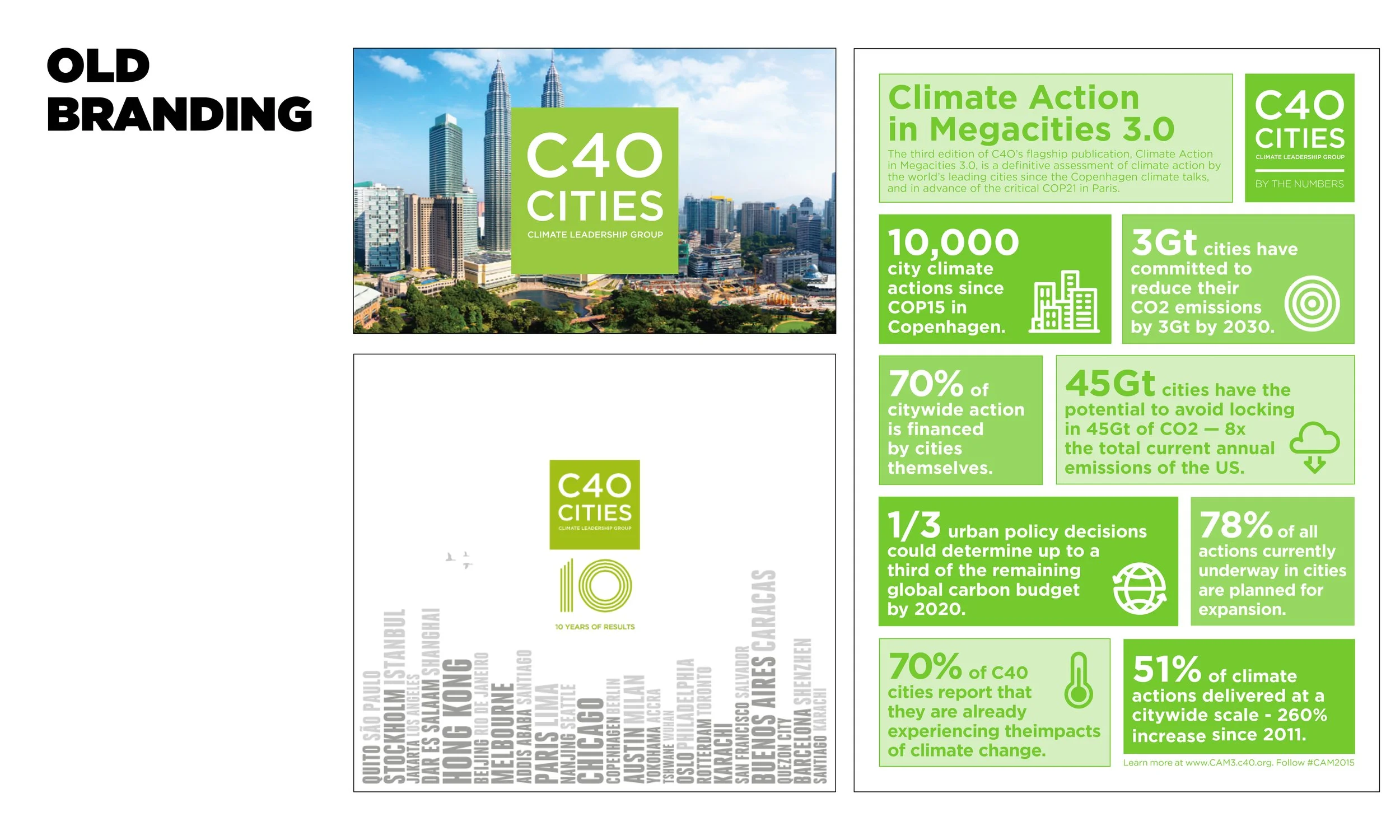
When I joined C40 in 2019, the brand looked like what you would expect from a climate NGO, a lot of green and a lot of stock photos, especially of city skylines. The visual identity wasn’t reflecting the idea and ambition behind it which contributed to the brand being overlooked by stakeholders. My challenge was to refresh the C40 brand to reflect its evolved narrative and lexicon, positioning it as a leader in the global climate movement.
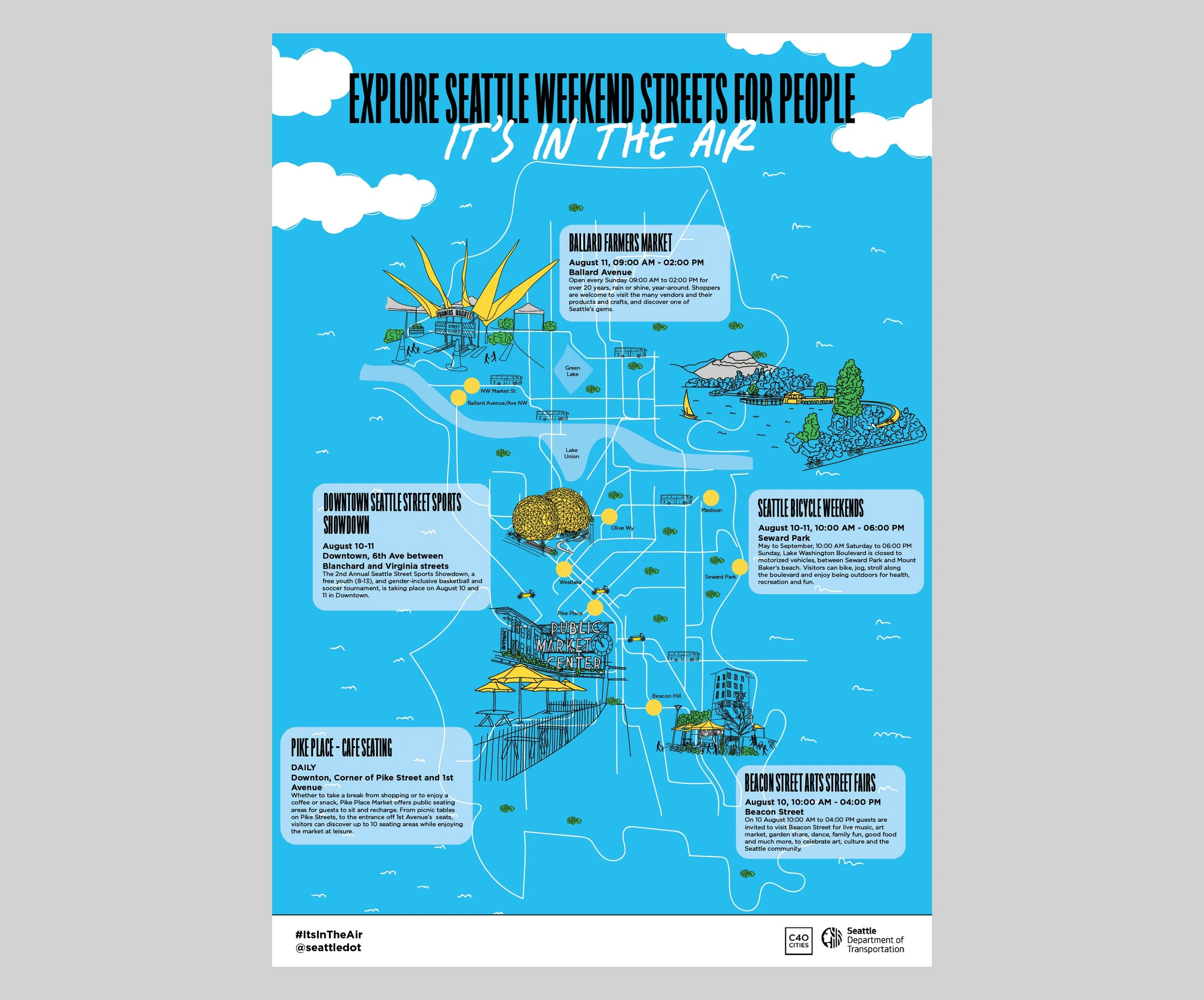
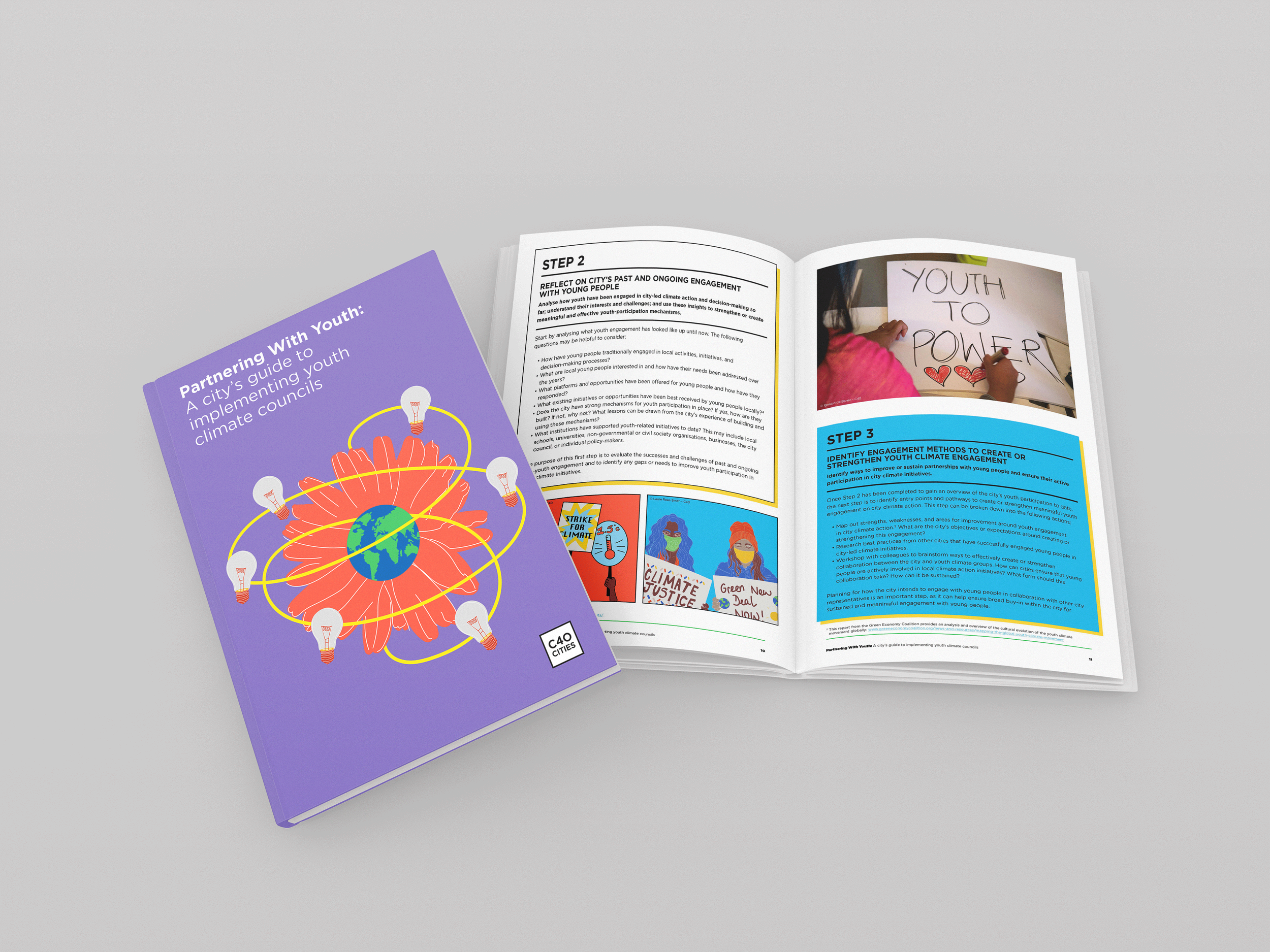
Using the brand values, we reimagined how these concepts could be visualised within the sustainability sector. We introduced a bolder colour palette, and a design block system that reflects the broad coalition that makes up the C40 network. The different blocks symbolise the partners, networks and programmes that collaborate and work together as one. The idea was also to add in moving image so the block system interrelates, emphasising their collaborative approach. I also created some custom illustrations and simple gifs to bring personality to their events, website and social channels.
The result was a brand that stood out. The brand increased engagement; the website visitor traffic rose sharply in the first six months and the social media following grew by 10% each month. C40 had a stronger brand presence, and a visual identity that actually matched the energy of the ideas it was supporting.